Configure the Gauge chart component
A gauge chart displays an aggregated value of a numerical measure. It uses a pointer to indicate where the measured value currently stands in comparison with target values (displayed as threshold values).
The following gauge chart types are available:
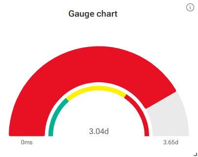
A circular gauge chart displays a measure in a data range arranged in a half-circle chart. In addition, it is possible to show a threshold legend in the form of a half circle divided into subranges by thresholds. By default, the measure has the color of the associated threshold or the configured series color. You can change the color of the measure in the measure settings.
Example
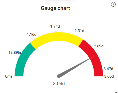
A speedometer chart displays an aggregated numeric measure in a data range arranged in a half-circle chart. A pointer indicates the actual value of the measure. The data range is divided into subranges using thresholds.
Example
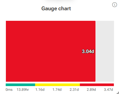
A bullet chart displays an aggregated number measure in a data range arranged in a horizontal bar. The bar size indicates the actual value of the measure. In addition, a threshold legend can be displayed in the form of a bar divided into subranges by threshold values. By default, the measure bar has the color of the matching threshold or the configured series color. You can change the color of the measure bar in the measure settings.
Example
Open the Configuration panel of the Gauge chart component. The Setup options are displayed by default.
In the Setup options, you can specify an optional component title and subtitle.
Select the chart type you want to display, Circular gauge chart, Speedometer chart, or Bullet chart.
Depending on the selected chart type, different options are available.
To show the measure value in the chart, enable the Show measure value option. The option is enabled by default.
To show a threshold legend in the chart, enable the Show thresholds option. The option is only available for the circular gauge and bullet chart. You can enable the option only if you specified and enabled thresholds for the Gauge chart component. The option is disabled by default. For more details, see Configure threshold values.
To show the minimum and maximum values of the measure in the chart, enable the Show min/max option. The option is only available for the circular gauge chart. The option is enabled by default.
To show scale lines in the chart, enable the Show scale option. The option is only available for the speedometer chart. The option is enabled by default.
To show scale values in the chart, enable the Show scale value option. The option is only available for the speedometer and bullet charts. The option is enabled by default.
You can specify a filter to be applied to the Gauge chart component.
Select Filters from the drop-down menu at the top of the Configuration panel.
Specify a filter for the component. For more details, see Add filters to an app component.
To remove the filters from the Edit filter panel, click the ... icon -> Clear all filters.
You can add a documentation to the Gauge chart component.
Select More options from the drop-down menu at the top of the Configuration panel.
Enable the Enable the 'More options' menu option.
Select the position for the More options icon (...) in the Button component. By clicking the ... More options icon in the component, you can display the documentation.
Click
 Edit content and specify a documentation to be displayed in the component.
You can enable the data export for the Gauge chart component. For more details, see Enable data export.
You configured a Gauge chart component.
Notes
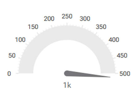
If the measure value is outside the data range, the charts indicate that the value is greater than the maximum value or less than the minimum value of the data range. You can adjust the data range accordingly in the measure settings. Select the measure from the drop-down menu at the top of the Configuration panel and adjust the data range. For more details, see Configure threshold values.
Example
The pointer in the speedometer chart indicates that the measure value is greater than the maximum value of the data range.
Circular gauge and bullet chart: By default, the half-circle of the circular gauge chart and the bar of the bullet chart have the same color of the matching threshold or the configured series color. If you want to use a different color for the measure as the thresholds, you can change the color of the measure in the measure settings. Select the measure from the drop-down menu at the top of the Configuration panel. Specify a color for the measure and disable the Use threshold color option.