Configure threshold values
You can display critical measure values in some components by specifying threshold values for these measures and emphasize them graphically. You can define rules to specify the value ranges and the coloring for the threshold values. For example, a colored background shows the threshold value range in which a measure value is located, Colored data points in a chart indicate the status of the measure values. With threshold lines you can display one or more colored lines for specific values in a chart. You can display thresholds in some chart types, such as line or column charts, and in the Table and Label components.
You have different options to specify threshold values:
Numerical values
You can manually enter threshold values.
Scripted values
You can define a script to calculate the threshold values. ARIS Process Mining provides a code editor to create scripted values .
Variable values
You can use variables that provide the threshold values. In this case, you must first define variables that you can use in the analysis .
Use the App builder to add an app to an analysis.
Add a component to the app, such as a line chart or table.
Add criteria to the component for which you want to display threshold values. You can configure thresholds for measures of the type Number and Time span.
On the Configuration panel of the component, select Thresholds from the drop-down menu. The Thresholds options are displayed.
To display the thresholds in the component, enable the Enable thresholds option. If you disable the option, the thresholds are hidden. Nevertheless, your settings are saved and you can display the configured thresholds again.
Configure a rule for the threshold values and their coloring. For charts, you can configure the coloring of the background, threshold lines, and data points. In the Table and Label components, you can only configure threshold values for data points.
Click Add rule for the relevant coloring, such as the background coloring. The Rule configuration panel opens.
Make your settings. The available options depend on the coloring (background, data points, or line) for which you want to configure a rule. See the options list below.
Click Done.
You configured threshold values for a component.
Notes
If you have defined various rules for the threshold values, you can change their priority. The first rule listed on the Configuration panel has the highest priority. Use the mouse pointer to move a rule within the list to change the priority. Please note that if different value ranges overlap, the range with the higher priority is also displayed preferentially.
Note the following if you added two measures to a chart component.
If you added two measures to the component, both measures are initially assigned to the primary Y-axis. If both measures are of different types (type Number and Time span), their values are automatically displayed as numbers in milliseconds. You can assign one of the two measures to the secondary Y-axis. Their values are then displayed in the original format.
Available rule options
Rule options | Description |
|---|---|
Y-axis | Assigns the defined threshold values to the primary or secondary Y-axis. Select the axis in the drop-down menu. This option is available for a chart component and if two measures are added to the component. One measure must be assigned to the primary Y-axis and the other to the secondary Y-axis. |
Measures | For data point coloring, open the drop-down menu and select the measures the threshold rule is to be applied to. |
Condition | Specifies a condition for the rule, for example, greater than >. Select the condition in the drop-down menu. The option is not selectable for threshold lines. |
Value | Specifies the value for the rule. Depending on the condition you select, you can specify a single value or a value range (From and To). Specify the threshold values in the corresponding input fields and select the scaling. By default, you can manually enter numerical values ( If you want to use scripted values, click the If you want to use variable values, click the |
Color | To specify coloring, click the color box and select a predefined color from the Theme palette or Series color tab. On the Custom tab, you can configure the color manually. You can select a predefined color and edit it on the Custom tab, for example, set the alpha value to change the color transparency. |
Show icon | Displays an icon in the Label component. Enable the option and select an icon in the drop-down menu. If you enable the option, the icon is displayed in the color you specified in the rule configuration, and the measure value is displayed in the color specified in the corresponding measure options. If the option is disabled, the measure value is displayed in the color specified in the rule configuration. |


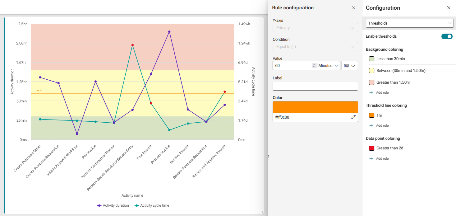
The following line chart shows the values of two measures, Activity duration and Activity cycle time assigned to the primary or secondary Y-axis. The background is divided into three colored threshold value ranges, green (less than 30 minutes), yellow (between 30 and 90 minutes), and red (greater than 90 minutes). The orange line (limit) indicates a threshold value of 60 minutes. The red colored data points indicate threshold values greater than two days for the Activity cycle time measure.