Build your own app
You can create your own app using the App builder app. Creating your own app allows you to configure your analysis individually. You can choose between various chart types as well as specify different dimensions and measures to visualize your process data.
Move the mouse pointer over an analysis in the Project panel.
Click
 Add new app. A selection of available apps is provided.
Select App builder. The App builder app opens.
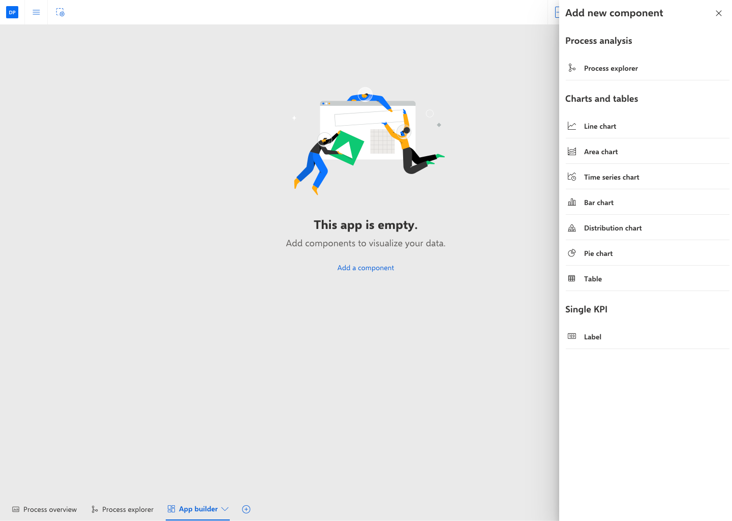
You must first add a component to your app to visualize your data, such as a line chart or a table. Click Add a component. The Add new component panel opens.
Select a component in the corresponding panel. The selected component is placed in your app.
Click Configure me in the placed component to open the corresponding configuration panel.
You can change the chart type in the Chart type drop-down menu.
You can enter a component title in the Title input field.
To specify a subtitle, click + Add subtitle and enter a subtitle.
You can add one or more dimensions depending on the selected component.
Click + Add dimension and select one or more dimensions.
Click Done.
You can add one or more measures depending on the selected component.
Click + Add measure and select one or more measures.
You can add a dimension or a measure as a sort criterion. Move the mouse pointer over a criterion and click the Add as sort criterion icon.
You can change the sort order of a criterion. Under Sorting, move the mouse pointer over a criterion, click the ... More icon and select a sort order.
You can display stacked charts if your analysis contains more than one dimension or measure. Enable the Stacked option.
If you want to display the dimensions on the y-axis and the measures on the x-axis, enable the Invert axes option.
If you want to hide empty values in your analysis, disable the Include empty values option. Empty values are displayed as "-".
If you want to abbreviate the values displayed in the chart, enable the Abbreviate numbers option.
You can customize the component layout. For example, you can change the colors, display a legend, or specify the dimension and measure axis settings.
Click the drop-down menu in the first line of the configuration panel.
Select Customize.
Specify your settings.
You can specify criterion details, for example, the display name, the aggregation, or the number of decimals.
Click the drop-down menu in the first line of the configuration panel.
Select the criterion to be specified.
Specify your settings.
You have created your own app.
You can open your new app in ARIS Process Mining view mode. In view mode, you can use an analysis interactively. It offers some functions that are not available in edit mode. Click the  View mode icon in the analysis header to switch to view mode.
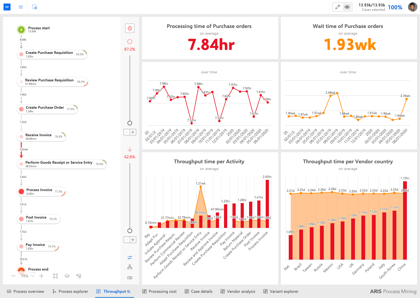
The following analysis includes seven apps, such as Process overview, Process explorer, Throughput time, etc., each displayed on a separate tab. The displayed custom app Throughput time contains various analysis components, such as flow chart, line chart, and bar chart.